
Enhancing Airport Lot Navigation
International Signage Standards
The Challenge
Airports are inherently high-anxiety environments. For travelers dealing with jet lag, tight schedules, or language barriers, clear direction isn't just a convenience—it's a necessity. Prior to this initiative, our international airport lots suffered from a fragmented approach to navigation:
Mixed Messaging: Inconsistent iconography and varying language hierarchies confused drivers.
Diluted Branding: Poor placement and low visibility meant our brand footprint was lost in the clutter.
Bottlenecks: Unclear directions around shuttle pick-up zones, payment kiosks, and exits led to traffic congestion and frustrated customers.
Inconsistent Quality: A wildly different look and feel from one country to the next weakened brand trust.
The Strategy in Action
1. Ground-Level Audits & Benchmarking
We started by auditing signage across more than 20 international airport lots. We evaluated what was actually working on the ground, measuring real-world variables like nighttime readability, sightlines, durability, and local cultural context.
2. Cross-Functional Alignment
Signage impacts everyone from construction crews to marketing executives. We brought together a coalition of internal and external stakeholders to ensure compliance and buy-in:
Facilities & Construction: For structural feasibility and material durability.
Brand & Marketing: To safeguard visual identity and tone.
International Operations: To handle boots-on-the-ground execution.
Local Airport Authorities: To navigate regional compliance and legal regulations.
3. Building the Modular Toolkit
Instead of designing custom signs for every location, we built a modular, scalable toolkit. This framework included:
ISO-Standard Iconography: Universally understood symbols that bypass language barriers.
Flexible Templates: Multilingual layouts with smart, localized defaults.
Spatial Standards: Strict height, distance, and contrast rules tailored for both moving vehicles and pedestrians.
Phygital Integration: Blending physical signs with digital kiosks and QR-driven navigation.
4. The Pilot Program
To test our theories, we launched pilot programs in high-volume airports across three major regions: North America, EMEA, and APAC. We gathered immediate, real-world feedback using on-site intercept surveys and daily operational reports from shuttle drivers.
Strategic Objectives
Our goal was to transform our parking assets from a logistical headache into a seamless, branded experience. We focused on four key pillars:
Universal Design: Create a globally adaptable signage system that speaks to multilingual and multicultural travelers without relying solely on text.
Frictionless Mobility: Drastically reduce the time travelers spend hunting for shuttles, exits, and payment hubs.
Brand Authority: Inject high-visibility, cohesive brand elements into high-traffic zones.
Scalable Deployment: Build a plug-and-play playbook to accelerate signage rollouts for both new builds and retrofits.
Impact & Results
The data from our pilot locations proved that clear navigation directly impacts the bottom line and customer loyalty.
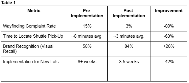
Key Insights
Icons Trump Text (Mostly): Symbols bypass language barriers, but they aren't entirely universal. On-the-ground testing is mandatory to catch local cultural nuances before a global rollout.
Information Hierarchy is Everything: Drivers make decisions in split seconds. Signage must always follow a predictable cadence: Where you are $\rightarrow$ Where you need to go $\rightarrow$ What service is there.
Contrast Dictates Control: Aesthetics matter, but strict color contrast and proper illumination are what actually prevent midnight navigation errors.
Trust the Locals: Centralized strategy is great, but local operational teams are the ones who spot regional roadblocks early. Their feedback turned a good framework into a great one.
Conclusion & Next Steps
Standardizing our international airport signage did more than just point travelers in the right direction—it eliminated a major pain point in the travel journey and solidified our reputation for premium, accessible service. By relying on a modular toolkit, we proved we can scale rapidly without losing regional agility.
Moving forward, this exact blueprint—combining universal design with localized execution—is ready to be scaled across other high-traffic, multi-language environments, including healthcare campuses, transit hubs, and flagship retail centers.
*Please note that the information in this document has been scrubbed to not expose internally private information. While the context and value are there, some of the details have been altered to become more directional.
Executive Summary
Parking lots are the first and last touchpoints of the airport experience, yet they are often the most stressful. Navigating an unfamiliar lot in a foreign country shouldn't feel like a puzzle. This white paper outlines how we built and deployed a unified, international signage framework across our global airport portfolio. By replacing fragmented regional setups with a standardized, intuitive design system, we streamlined traveler wayfinding, cut down operational friction, and substantially elevated our global brand presence.